Blend your packaging into the background and never leave
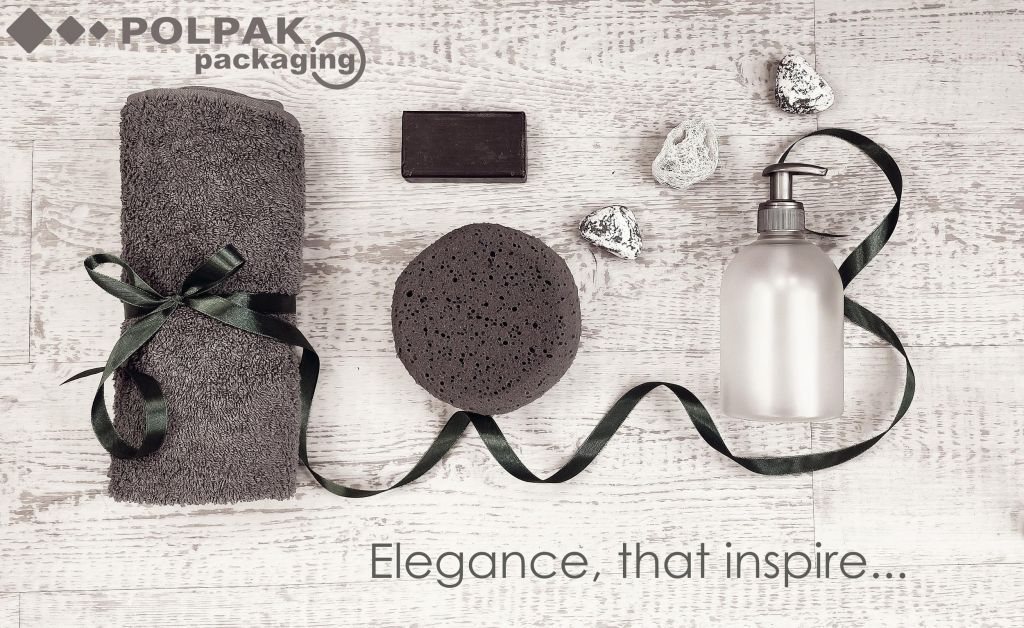
Total look, also known as mono look, is a timeless elegance. It applies not only to clothing or interior design elements in mono-colours, but also to cosmetic packaging. Monochromatic designs are chic and tasteful, no matter the trends or passing fads.
Dressing tables full of multicoloured bottles, dispensers, sprayers or jars may be charming, but to truly bring out elegance, they should match the interior.
When choosing cosmetics, many customers pay attention to their packaging because they want its colours to match their dressing tables or bathrooms. Others buy new products and pour them into their own bottles or jars, which is devastating to building brand loyalty. Right after choosing our product, the buyers remove our brand from their homes. Pouring shower gels, shampoos or liquid soaps into customers’ own packaging makes them forget the brand. Even if the product is good and fulfils expectations, the customer may not buy it again without the original packaging with product information.
Match the packaging with your client’s bathroom!
We offer our packaging closures in virtually any colour. Full Pantone colour guide offers shades you didn’t even know existed. Choose any colour for you packaging or closure – the only limit is your imagination!
But when you work on your packaging design you need to consider the real destination of your product – your client’s home.
Blood red, hot pink or electrifying green may be eye-catching, but in time these colours may start to irritate. We are flooded by overwhelming multitude of visual and sound impulses that attack us from every direction, and so we want our home to be a quiet refuge of peace and serenity, with least distractions possible. We are the ones who decide about the number and quality of the elements inside our four walls.
As cosmetic products manufacturers we should respect rules of a home we want our product to live in. Even for a brief moment.
Soft shades of green, grey, or timeless black and white, are always a good choice. Matching monochromatic closures with bottles and unaggressive labels with as little information as possible may attract more clients and improve brand’s reception.
“Less is more”
Juggling with shades is great fun. But being bold about colours is also choosing earth tones that perfectly match monochromatic bathroom or dressing table design. Sometimes less is more. Opting for one shade for the complete composition will not only make our product look elegant, but will also make it a permanent element of the interior design. Packaging that becomes part of the home environment will be an automatic shopping choice for your customers during their next trip to the beauty store.
Choosing best packaging design for our products is a challenge. All manufacturers and brand owners must know their ultimate goal and target customers.
Our team will be happy to assist you. We will help you select best sprayers for viscous substances or tell you about advantages of disc-tops over flip-tops, but we will also help you design coherent packaging that will attract your target customers.
Other
What does the latest research say about PCR packaging? How much does recycled content actually reduce the carbon footprint? And finally: how do consumers really perceive PCR packaging?
The European Cosmetics Market: Growth, Sales Structure, and Packaging Development Trends.
Why do natural cosmetics so often require a dispenser with a no-contact mechanism? The answer lies in the metal spring…
We are currently in the transition period of the PPWR - what comes next?
We are delighted to have wrapped up this year’s Beautyworld Middle East in Dubai. Thank you to everyone who visited our stand - for the inspiring conversations and the positive energy we’re bringing back to fuel new projects!
For the first time, we’re introducing airless packaging with a spray pump. This unique solution combines the benefits of an airless dispensing system with the convenience of a fine mist application.
We’re delighted to announce that Polpak Packaging will be exhibiting for the first time at Beautyworld Middle East in Dubai!
In today’s world, where products compete not only on quality but also on appearance, packaging becomes a silent salesperson.
The packaging world is undergoing a transformation driven simultaneously by concern for the climate, rising consumer expectations, and regulatory pressure from the European Union.
Based on the latest McKinsey article, “Sustainability in Packaging 2025: Inside the Minds of Global Consumers,” published in June 2025, we took a closer look at what consumers expect from packaging, and what truly ranks highest on their list.
More and more brands today are turning to packaging solutions that comply with the latest environmental regulations. Polpak Packaging is rising to meet these challenges by introducing a new product to our range: the D 371-01 monomaterial dispenser!
Smart packaging is no longer just a concept from the future – it’s a real solution already being developed by companies across various industries.
The packaging industry is currently undergoing a significant transformation due to changing European Union regulations and growing consumer expectations regarding sustainability.
Cosmoprof 2025 is behind us – the largest trade fair in the cosmetics industry, which, as every year, brought together market leaders in packaging, innovators, and cosmetics manufacturers from around the world.
Have you ever wondered how the first lotion pump was created? There’s an interesting story behind it, all thanks to Robert R. Taylor.
Greenwashing, a negative market practice involving the promotion of products, services, or packaging as eco-friendly without real basis, is becoming an increasingly significant issue.
The cosmetics industry is one of the most dynamic market sectors, where shifting trends, innovative technologies, and increasing consumer demands continuously shape its development.
December has arrived, and the days are getting colder, signaling that winter is fast approaching. Although freezing temperatures have not yet arrived, now is the perfect time to prepare for the coming chill.
In the dynamic world of cosmetics, pharmaceuticals, and personal care products, airless packaging has become an essential element that meets the needs of both manufacturers and consumers. Its reliability and hygiene have earned it growing popularity in the market.
In the world of cosmetics, pharmaceuticals, and household chemicals, packaging is more than just product protection. It is the first impression, the brand key and an element that can attract a customer’s attention or let it slip by.
Decisions regarding packaging made by companies are built of many details. Packaging is analyzed from multiple perspectives: legal, logistical, ecological, technological, and marketing.
Sometimes something that we would never think that it might be a mainstream trend becomes fashionable. Seemingly down-to-earth, trivial things which are even disliked by some people become a passion and hero of TikTok videos!
That’s the topic of the presentation which Małgorzata Chomiuk – Marketing Manager at Polpak Packaging will deliver at the conference organized by Creative Packaging Group Cluster, during BIO EXPO WARSAW trade fair.
The International Trade Fair for Organic Food and Products will be held at Ptak Warsaw EXPO, and will last for three days – from 3 to 5 October 2024, and the conference itself will take place on the first day of the trade fair, i
Scents charm, enchant, evoke memories, take us to magical lands, and are a real delight for our brain.
Sometimes a scent smelled unexpectedly can become a pleasant moment of the day, and sometimes it creates a compelling impression that we want to repeat.
Specialists in fragrance compositions are well aware of the fact that they wield enormous power.
Consumers are lying on beaches, planning a trip or happily counting down the days to the summer vacation, while using cosmetics that were designed in the winter... Therefore, summer at cosmetic companies is the perfect time to plan Christmas sets.
It’s said that less means more, so it may be analyzed perversely, and we can come to the conclusion that more means less!
Unit packaging has been blacklisted for some time now. What legislators and consumers keep very close tabs on is not only small cosmetic packaging, but also bulk and dispatch packaging,
The European Union will make shopping for consumers easier.
For a few years now, environment protection has been an important part of our everyday life. On one hand, consumers want to be more eco, and, on the other hand, manufacturers want to show them that it’s choosing their products that will make them environmentally friendly.
PCI Days is a unique source of new ideas for cosmetic products, consolidating the Polish industry, in order to effectively develop and implement innovative solutions.
It’s an irreplaceable barometer of moods and trends for decision-makers in the Polish cosmetics world.
Saving cosmetics in an art which requires tactics and finesse, just like saving money or time.
So what can be done to make most of each drop of the favorite face cream of lipstick?
Can a trade fair make you dizzy – certainly!
Are trade fairs the time when we learn most about ourselves, our company, about the needs we satisfy and about what we can improve?
Definitely!
Hair is one of the attributes of healthy appearance which both women and men want to boats of.
Cosmetic companies have understood this need, and we understand that the most effective cosmetic must be enclosed in handy, safe and convenient packaging, which is why we've decided to introduce a new product to our range.
The cone-shaped cap with an additional
On the 23-25 April, during WarsawPack trade fair at Ptak Warsaw Expo exhibition center, Polpak’s both departments – i.e. the machine department and packaging one – will be presenting their offer.
We'd like to encourage to use the discount code, thanks to which you’ll get a discount when buying entrance tickets.
The code with number 1675555CS should be used on the website: www.cosmoprof.com
On 21-23 March, we'd like to invite you to our stand at the Cosmopack trade fair in Bologna!
Displaying our offer at international trade fairs on the markets to which we deliver our products on an everyday basis is particularly important. It gives us an opportunity to present the whole offer of cosmetic packaging, closures for packaging and the additional services we provide. First of all, however, it’s a unique chance to meet the clients w
Our world is flooded by plastic. Since the beginning of the “plastic age” we’ve been able to reuse just 10% of that material. It's a drop in the ocean, given billions of tons which were produced in the 1950s, when plastics took everyday life by storm.
Thus we can conclude that one of the trends that will or should accompany us in order to meet consumers’ and legislators’ requirements will be the new technology.
Packaging is pilloried by environmentalists and legislators.
Is more plastic a recipe for less plastic?
Although it may sound illogical, in certain cases such an approach may help reduce the amount of waste in landfills, and increase the percentage of products that are recyclable and thus returned for reuse.
As early as on the 1st December, during the conference organized by the Polish Association of Cosmetic and Detergent Industry “Good packaging – choice or requirement? – how the green revolution fosters product innovations”, our Marketing Manager – Małgorzata Chomiuk, will discuss whether the cosmetic industry may resign from plastic.
A small great thing!
The popularity of droppers is still on the rise!
Last year we sold nearly two million such closures!
Although their shape is untypical, they are really popular!
What’s the secret of the M 623-01 mist sprayer with a clip?
Creating dream product packaging that will meet the eco-design requirements is a very difficult task.
On one hand, brand owners and packaging designers spare no effort to make sure their product stands out among the competition, and, on the other hand, they feel obliged to protect the environment and want to keep their products within the eco trend.
Although our closures reign supreme among human skin care cosmetics, they also thrive in the animal kingdom.
Numerous entrepreneurs and institutions are waiting for the entry into force of the PPWR (Packaging and Packaging Waste) regulation. Unfortunately, it isn’t wistful anticipation of the desired change, but rather a fearful gaze through the peephole, in the hope that the change isn’t coming yet.
Although the summer, being the holiday leave period, is in full swing, we aren’t loafing around.
We have for you…
a beautiful
NEW PRODUCT
available on special order.
Vinegar, soap flakes, citric acid...
And, in addition, essential oils!
A short hint for those who don’t follow online eco-cleaning trends:
they are basic ingredients to prepare environmentally friendly detergents!
Last year our company celebrated its 30th anniversary.
It’s an age at which brave actions should be taken!
And that was the case!
Together with Pablo, a machine manufacturer, and Mitsubishi Electric we’ve established Creative Packaging Group Cluster.
Yes, yes, it’s time to think about how to surprise clients before Christmas.
No matter how much we’d like to keep the summer, the experience tells us that we won’t succeed.
According to the same source, December and the period for gifts will come sooner than we think.
Plastics comprise a total of more than 100 different materials, which can additionally be combined into composites or laminates, added reinforcing substances, dyed, enriched or made more flexible, non-flammable or UV-resistant.
On our blog, we often talk about environment protection, the carbon footprint left in the production and transportation of various types of packaging and products, we discuss recycling – its effectiveness in its current form, its varieties, as well as properties.
The Düsseldorf trade fair, which takes place every three years, is the genuine jewel in the crown of our industry's meetings thanks to its exclusiveness.
The packaging industry is developing rapidly, and the show of the novelties and innovations of the past three years made us all realize how much progress we make.
Our approach to the environment protection, packaging optimization and appearance, as well as technology was on full displa
The first industry trade fair of this spring is behind us!
Thank you very much for visiting our stand, subject-matter comments and casual meetings.
Spring is the trade fair time!
This year we’ll be present at the largest industry meetings in Poland and Germany!
Corrugated and aluminum droppers with the 20/410 thread size!
Up to now, our clients have had at their disposal:
corrugated: 18/410, 18/415, 18/410 CRC and aluminum ones: 18/410, 18/415.
The plastics industry, together with the packaging one, have recently been observing legislative changes with great concern. Both those which have already been introduced, and the information about the upcoming ones.
The eco-design and recyclability classification are the terms that have entered the cosmetic manufacturers’ glossary for good.
We are proud and pleased to boast of receiving an award in the form of Forbes’ Diamonds 2023!
We are happy to have been appreciated on the nation-wide market in Poland, but, first and foremost, are pleased with the fact that we keep providing services to our clients with unwavering energy and dedication.
Portals, female influencers and women's magazines are summing up the year, awarding cosmetic hits!
Our contracts with companies rule out providing details as to which cosmetic is closed in our packaging. But we can sum up this year, indicating our sales hits!
What the most popular cosmetics of 2022 were closed in?!
that will change the way the client perceives your product!
For the better!
Foam pumps are handy, neat, comfortable, as well as more and more fashionable.
They can be used in an increasingly big number of products.
Have a look why including them into your cosmetics is worth considering.
In the end of the year Pantone Institute announced the color of 2023 – Viva Magenta!
Today, we are presenting our proposals for closures in that color!
Today, we offer a different solution, and in line with the upcoming EU requirements, we have already introduced 30% of recyclate content in our products.
This recyclate comes from the closed circulation in the plants in which our products are manufactured.
Environmentally friendly solutions in the Polpak Packaging offer!
An interview with Katarzyna Piątek, the head of the Polpak's packaging department.
- What it's like to promote plastic these days?
While everyone is wondering how to get rid of plastic and find replacements for this material in cosmetics packaging, we invariably and consistently try to tell you how to live in harmony with it.
What consumers expect from cosmetics is strong concentrations, fast action and top quality. They have to meet the same requirements as medicinal products, and hopes for the same effectiveness are pinned on them.
Indeed, we won’t offer packaging for mascara, retractable eyeliner, lip gloss or even eyeshadows.
Plenty of cosmetic companies face difficult decisions, how to maintain the current level of products supplied to the market and, at the same time, reduce their price, or at least make it immune to the impact of the skyrocketing inflation?
Cosmetics are the most popular type of a Christmas gift. The statistics from the recent years show than nearly half of Poles buy them for their loved ones under the Christmas tree.
Our task is to have all details on the offer, inform them, and address the needs of our clients’ customers.
Consequently, we are presenting a new product today!
A reducer for a bottle closed with a dropper.
For years manufacturers of cosmetics have been in the hustle and bustle of information regarding environment protection.
One day they learn that plastic is the ultimate evil, and glass is the remedy for all problems connected with that protection. The next day, however, it turns out that the production and transportation of glass leave a huge carbon and water footprint on the planet, contributing to the ever-increasing greenhouse effect.
There are a lot of products which are, to some extent, both a detergent and cosmetic at the same time.
They should be dispensed as a detergent, e,g, their spray should be nice.
But their appearance should be delicate and subtle, as in the case of a cosmetic.
Black color is believed to be elegant, but also neutral and practical. A closure in this color can be easily matched with other colors of bottles or labels, achieving a perfect combination.
Detergent themselves aren’t associated with environment protection, but rather lead to negative associations with chemical substances which end up in sewage, and adversely affect water flora and fauna.
Fortunately, in fact in most Polish cities our home or factory sewage undergoes a long and complex purification process as part of which it’s filtered at many stages, and, to the greatest possible extent, restored a condition in which it can
Looking at innovative solutions, we need to anticipate their consequences.
Biopackaging or so-called eco-friendly packaging sells great, and may become the core of the product’s or brand’s entire marketing campaign. The question is, whether with the current knowledge and the ability to look ahead, this behavior is justified from the environmental point of view.
Will the balance of profits and losses be positive, and if so, for whom?
<
We can assume that the world is crazy about environment protection. What would be more correct to say, however, is that the world was crazy when it didn’t think about it at all.
We live in the period in which we already know that our thoughtless attitude to littering the Earth must come to an end.
Following trends, and even setting new ones, we try to surprise our clients with new products every now and then!
This year, those who visited us during the Cosmoprof trade fair in Bologna were impressed by the new products on our offer.
If Bologna always welcomes guests in such a way, we want to be there more often!
Protective packaging, because we will be talking about it, doesn’t have good reputation as a medium for advertising functions. However, the sales value of the protective film can’t be overestimated.
It, therefore, means that you are responsible for what you’ve created or what you have put on the market. From the very beginning until the very end.
When our neighbors need help, we devote all our power and energy to provide it!
The trade show is a celebration for the industry!
It’s the place where clients meet their suppliers, competitors meet each other and, most importantly, potential suppliers meet potential clients.
Our offer is rich in products that are used in cosmetics or household detergents.
However, there are such nooks and crannies in our catalog that only a few look into, and maybe it's time to show off a pump with a really BIG DOSAGE to a wider audience!
Mini triggers are among the most interesting closures in our offer.
This solution is, in a way, a link between the cosmetic and detergent offer of our products. Mini triggers can be perfect closures of both home, and beauty products.
For a long time now we have been on a kind of crusade for plastic, emphasizing its advantages and appreciating its unrivaled physical and chemical properties compared to other materials. Sometimes we felt like the devil's advocate, but the more research was conducted, the more studies were published, the bigger sense we saw in our work.
We’re aproach new year!
We're entering it with hope and a strange request that is unlike its last two predecessors.
In late December, Pantone Institute announced a very energetic purple, with the graceful name Very Peri, to be the color of 2022. The symbolism behind it, given by the authors, involves self-reflection, curiosity and a bold look into the future.
And the latter, despite all adversities, is what all of us need mos
Our "regular distribution", that is ready-made products available in our Warsaw warehouse, is an answer to our Clients’ needs. We closely watch their interest and orders, and on that basis make decisions on introducing products to the list of “immediately available” ones.
Trend research focuses not only on the preferences of younger age groups who are growing up to enter the market as consumers, but also analyzes the behavior of those already present on it.
The ‘Silver tsunami’ is the beautiful name for the 55+ age group, which for some time now has been a colorful sociological and market phenomenon.
Modesty is our second name, just after reliability!
Today, our reliability has been appreciated, so we have to overcome modesty and loudly as well as proudly say:
We are one of the “Forbes’ Diamonds 2022” winners!
Our trade fair autumn is slowly coming to an end, so you will have an opportunity to meet us one more time in the final of that tour, during WarsawPack in Nadarzyn (23 – 25 November).
That stand will feature our both departments – the production of packaging lines and ours, i.e. closures for packaging and cosmetic packaging.
Until recently the list of packaging functions seemed to be complete. The packaging and its closure were supposed to tightly secure the product against a leakage, dispense it in the most comfortable and secure way, as well as fulfill marketing functions.
We offer different thickness and width of the polyolefin heat shrink film and what comes with it is a wide range of its possible uses. Polyolefin is one of the most environmentally friendly plastics as it is a polymer made up of carbon and hydrogen which makes for an ideal material recovery. Some claim that the aesthetic and end result are what matters the most.
We are really pleased that we had an opportunity to see our regular clients in a good shape and, first of all, in good health.
It was a great pleasure to us that the stand was visited by representatives of companies we hadn’t had a chance to cooperate with.
Does every element need to distinctly emphasize the brand, or is it worth unifying the packaging and, sticking to minimalism, focus on the identification expressed by the printed inscription on the label?
We are happy that after the two-tear break caused by the pandemics we can participate in trade fairs again.
We are really looking forward to meeting our Clients and potential Clients, as direct conversations at our stand are really important to us. Although recently we have often seen each other online, we believe that getting back to classic face-to-face meeting is crucial. Casual conversations at the stand are not only an oppo
The Quality Control Department is one of the most important places in our company. Thanks to the processes, examinations and tests that take place there, our clients get efficient, failure-free, pretty and clean products.
What must happen, however, for them to be deemed such?
Recently, we have been forced to again raise the prices of our products.
We feel obliged to explain the reason for these changes.
In the recent two years, so from the moment of the pandemic outbreak, the costs of transport of a container on intercontinental routes have increased eight times.
Mist sprayers, as a majority of elements of packaging have to play several roles. They should mostly be functional and adjusted to the medium.
Lately there have been wide discussions that if we don’t save our planet, our next generations won’t be able to use its resources. Climate change is a fact and nobody can argue with it, but we still talk about the methods to care for the Earth without further harm.
The very first product that comes to our minds when we think of a trigger sprayer is of course a window cleaner. It is used in households, offices and other public service places. Lately, the store shelves have been stocked with more and more different products closed in trigger sprayers.
Purchase decision are made by consumers as young as 3 or 4 years old! They are the main target groups of the online or TV ads played during the cartoons. Kids are also more susceptible to the store displays or creative points of sale.
Nowadays customers become more and more eco-conscious. People read and analyse the product composition and are aware of the materials used for packaging. Many shopping choices are made based on their eco-friendliness.
More than ever before, the last year truly proved the fact that we live in a global village. Every country, almost every business owner, and finally every man, depend on other people and random events. We always knew it in theory, but now we have found it to our cost.
Hair obsession, which is a conscious hair care, has recently become more and more popular and gained many female followers.
Plastic recycling has been widely discussed for a long time now, but the topic has not been exhausted yet and there is a lot more to cover
Polpak Sp. z o.o. joined the elite circle of companies awarded with the Business Gazelle title!
Does the outbreak of the pandemic relieve the businesses from the eco-responsibilities?
In the first part of our eco-design series we covered its main principles and explained why it is important to stick to it through all stages of the product development. We already know how to choose a bottle. Now we will discuss the remaining packaging elements along with their eco-versions.
Eco-design is yet another newly coined term that has recently entered our dictionaries. Its etymology is self-explanatory, but what does it really mean? What requirements have to be met in order to call a product’s design “eco”?
Yellow and grey have been crowned the colours of 2021. The choice is not random: it reflects the lifestyle and mood prevailing in the current situation.
We are closing 2020 with record sales – in the second part of December we hit 100 million sold products!
In the first part we discussed some of the problems our traders have to deal with on a daily basis. We put it forward to share the knowledge and show you that some solutions must make not only for the visual effect, but firstly for the better functionality of the packaging with the specific medium and bottle.
From time to time we lift the veil of secrecy surrounding our company’s internal affairs. We write about our cool team of well-tuned members who love their jobs. This year we shared a few honest thoughts on our business branch which suffered many turmoils and swirls.
The history of the breakthrough inventions shows that scientists from different places researched a phenomenon or worked on a specific project at the same time, and then announced their revolutionary findings virtually simultaneously.
Since the Polpak Packaging department now also offers polyolefin shrink film (also called shrink wrap), we are able to not only deliver perfect packaging closures and complete cosmetic packaging, but also become the next chain in securing our Customers’ products.
The ever-growing amount of plastic contributes to its ever-worsening opinion.
Most of our world contains polymer elements and most of the eco-media coverage presents it in a negative light.
We, on the other hand, try to write not only about its phenomenon and versatility, but also the fact that if we take proper actions, we can prevent it from flooding the world.
Primum non nocere – first, do no harm!
Multithreading of eco-behaviours is incredibly elaborate. Attempts to create a perfect system that would reduce the amount of produced waste and simultaneously save water and minimise the carbon footprint, must be based on knowledge and, paradoxically, intuition, but first of all on common sense.
As cosmetic packaging and closures supplier we are a part of Polpak Sp. z o.o. Depending on different industry branches, the company is known for various products and services.
Coronavirus has frustrated our plans for this year. It has paralysed delivery times and forced organisers to cancel planned trade fairs.
Paradoxically, it has also strengthened our company’s values! Preaching nice and smooth slogans at calm times doesn’t require much effort.
Aluminium products are much appreciated in the packaging, food, cosmetic and industrial branches. This metal is light and easily processed, whereas products made from aluminium are relatively durable and practical.
What is it all about?
Why is one hard and transparent whereas another matt and flexible?
Why will we sleep very well on one while another will be bulletproof?
Less is more
All business branches and almost all people are in one way or another affected by the outbreak of the pandemic. Market analysts, psychologists and other experts prepare studies or speculations as to what and how has changed, how bad it is and how worse it is going to get.
Although at first glance the above motto may be a little baffling and one could wonder: 'What does that have to do with the price of tea in China?', there exists a deep connection between production and recycling.
Reduction of waste has long been a hot topic, discussed not only by the environmental organizations, but also politicians all over the world. The issue covers already existing waste, waste that is being introduced to the market, as well as future waste generation. Laws, directives and restrictions shed light on the problem and force entrepreneurs to take preventive measures in order to reduce to minimum the landfill sites that are scattered al
Over the centuries of the human existence on Earth, people’s needs have steadily increased. In ancient times, a fireplace, own cave, a piece of leather as clothing and hunting for wild animals was enough to survive. However, increased appetite, the desire for comfort and the need for an easier life were an impulse for ongoing improvements.
The very first and important stage of the recycling process is sorting waste at home. But what happens later?
Where does the waste end up and how does a PET bottle transform into a fleece sweatshirt?
The “zero waste” philosophy has recently gained great popularity. More and more followers try to live by its rules. We don’t fall behind either – we’ve already written about its multidimensionality and the fact that “zero waste” is not only about groceries and not wasting food, to which it is very often reduced. If it’s called a “philosophy”, it should apply to wider aspects of life and general lifestyle.
We often bring up the subject of ecology, sustainability, as well as care and respect for our planet. When we started introducing products made from plastic to the market, we took upon the responsibility to inform our customers and end-consumers how to deal with the packaging after use, once our products become waste.
May these Easter holidays fill your hearts with hope, faith and joy.
We wish you good health, peace and optimistic views on the future.
All the best,
Polpak Packaging Team
Aluminium can be processed an infinite number of times!
Aluminium is lightweight, which means it’s cheaper to transport!
Aluminium is solid and elegant, boosting edgy or vintage look!
Have a look at our 10 to 350 ml jars!
Starting on Monday, March 16th, we are joining the #StayHome campaign.
We are switching to remote working mode.
We will meet on 24-25 June at EXPO XXI centre in Warsaw!
We should always plan our holiday trips ahead. Not only our destination, but also items that we want to take with us!
In 2018 the Polish Ministry of Environment launched the electronic database on waste. The aim of the register is to control waste introduced to the market, its circulation and disposal.
POLPAK Sp. z o.o.
Kabrioletu 4
03-117 Warsaw
Poland
The new year is associated with new resolutions, plans and dreams that we wish to fulfil with a new beginning. Sadly, according to the statistics most of these exciting promises go up in flames already mid-January.
Even though December is the last month of the year, devoted to important summary of the past twelve months, it is also a promising beginning of the upcoming year. During this time international analytic companies publish the results of their research and set new trends for 2020.
Twisted!
According to the Internet wisdom “simple solutions are the simplest”. We truly believe it and our offer reflects it. We care for our customers, hence instead of complicating their decision-making process, we try to simplify it. Sometimes less is more and a narrow selection of the finest products is the key to success. Our long experience and sales analysis show that three types of bottle caps for white co
Light as a feather!
What comes to our minds when we think of chocolate mousse, meringue or Marshmallows? Lightness and treat for the palate. But foamy texture is not only desired in the kitchen – we also love it in cosmetics.
Meet the airless packaging and its magic!
No air, full functionality!
Not long ago we described essential functions of a packaging. It should mainly protect the cosmetic product, provide easy application, be appealing to the eye and eco-friendly.
ATTENTION!
The annual factory closedown is close by!
Special order products with longer lead times!
The turn of September and October was a very intense time since we visited the industry trade fairs in the country and abroad.
Autumn is for us the beginning of a new season that we’ve been diligently preparing for for a few months now. We’ve observed the market and analysed orders made by our customers. Therefore, we’ve decided to add 9 new products to our standard, permanent distribution.
Our favourite subject is of course… packaging.
It’s our passion, job, reality and entertainment.
From dusk till dawn our Polpak team members dose, pack, send packaging and receive new inventory. We send e-mails, make phone calls and gossip about one thing only.
Total look, also known as mono look, is a timeless elegance. It applies not only to clothing or interior design elements in mono-colours, but also to cosmetic packaging. Monochromatic designs are chic and tasteful, no matter the trends or passing fads.
Dressing tables full of multicoloured bottles, dispensers, sprayers or jars may be charming, but to truly bring out elegance, they should match the interior.
The beginning of the year brought new recycling rules – what used to be three different recycling receptacles have now become six.
According to a survey conducted by Kantar TNS on behalf of the ProKarton Foundation, Poles are paying less attention to sorting waste.
For many of us summer is the most beautiful season. High temperatures, long days and sunny mornings power us up and boost us with energy for action. Vitamin D, the sunshine vitamin, charges our batteries for the rest of the year.
Every year in June we join the CosmeticBusiness trade fair in Munich and present our products to the industry members from the Western Europe.
We are living in a time when information appears in an instant and it circles the world even faster. We are flooded by news coming from each and every direction, some of which is so-called 'fake news', i.e. untrue information, the purpose of which is to be sensational, cause outrage, controversy or generate traffic to the website on which it was published. It is up to us to separate truth from falsehood, because official refutation either does
Let‘s meet us on CosmeticBusiness - International trade fair of cosmetics supplying industry in Munich, Germany.
This spring trade fair in Warsaw is an opportunity every year to meet our regular customers, to get to know new companies and to establish interesting business contacts. It gives us an opportunity to present our new products and the entire spectrum of ways in which they can be modified, something that is of vital importance to us!
Let’s meet at the trade show in Warsaw!
On 2nd and 3rd April, the Warsaw exhibition and trade centre EXPO XXI is hosting another annual Packaging Innovations event. Our team will be waiting for you in the Green Hall at stand A11.
Another spring is around the corner, and we are all taking off our heavy clothes to be able to enjoy the sun, which is getting warmer every day.
Does all packaging have the chance of a second life?
We would like to thank all our Clients and Partners for their trust and we sincerely wish you a happy Christmas with your family.
In response to the countless discussions and books that address the present condition of our natural environment, all kinds of measures and solutions that address the problem are proposed, some of which do not even require much effort and can be implemented by just about anyone.
Minimalist lifestyle: what does zero waste mean?
The pollution of our oceans, seas, rivers and forests is a topic that each of us encounters daily. Despite how much the issue is discussed, the countless conversations and conferences on it, it is still difficult to deal with it effectively. So, it is worth stressing how crucial it is that absolutely every single inhabitant of our planet is committed to tackling it. The every day choices and decisions of each individual not only have specific
Autumn is always a busy time in the packaging business, with numerous industry events to attend. This year is no different. Those interested in cosmetics packaging products and closures are in for a treat with a number of important events, where they will be able to see the latest and the most innovative developments in the field
A major part of it is plastic and unfortunately a lot of it is still stored in landfills. Recycling and ecology are recently one of the main topics discussed internationally, primarily because of the fact that waste production is a growing issue. How does that all relate to packaging products? Has the present situation been caused by plastics as such, or is the consumers' missing awareness to blame?
Packaging products suitable for pharmacy shelves
Protection, safety, hygiene of application – these are the essential features of a good packaging product
“Fine feathers make fine birds”, or fashion and trends in packaging design.
Have you checked out the new products in our permanent range yet?
Polpak Packaging invites you to CosmeticBusiness 2018!
Thank you for participating in Packaging Innovations fair!
Airless packaging solutions for special assignments.
We would like to invite you to the Packaging Innovations International Trade Show.
Airless packaging – calculating the print area.
We are expanding the range of products available on stock.
How to measure the dip tube length with a ruler – quickly and simply.
From the series: A little „know-how” – How to choose an optimum dosing mechanism for the product?
Big possibilities of a small packaging closure.
A little bit of 'know-how' - What kind of tube should be used in packaging?
Interesting application of closures and packaging in food industry.
Already in the second half of October new products will appear in regular distribution in Polpak Packaging. This time we are offering you two new models of trigger sprayers and one model of foam sprayer.
Danish Beauty Award 2017 - packaging and cosmetics nominated for an award!!!
Made for each other – how to choose the packaging for a cosmetic product?
Natural, ecological and innovative cosmetics – current trend in cosmetic industry.
Thank you for visiting Polpak Packaging at the Cosmetic Business fair!
New products from Polpak Packaging on Cosmetic Business fair 2017!